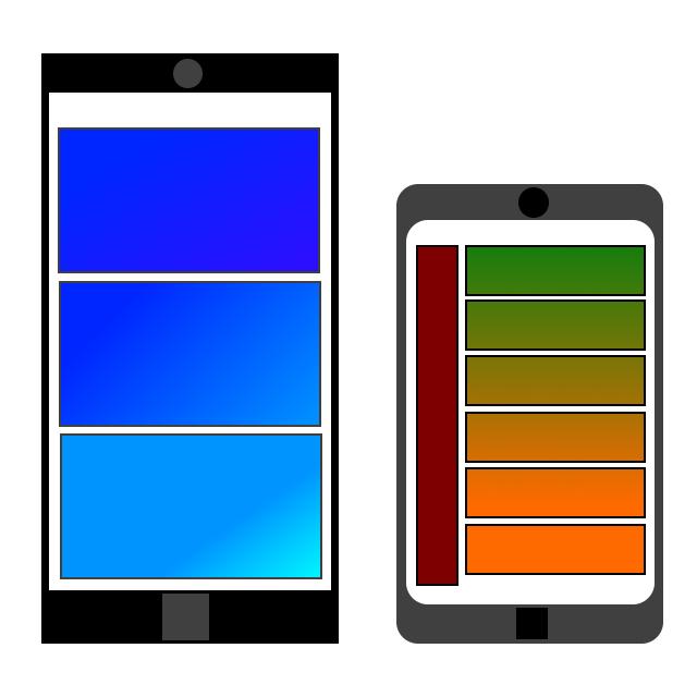
How the internet is evolving and adapting to mobile devices
Is the world getting smaller, or are we becoming more mobile? Technology has paved the way for this major shift. Not only is it the phone, but it is actually the smartphone that is responsible for this. Today, smartphones are dominate in the market. We use them for paying bills, working, socializing, navigation, information, emergency services, and everything else in between. The smart phone has allowed us to be connected with everyone and everything while replacing several gadgets all at the same time. Your phone is a camera, a camcorder, a computer, a calculator, a flashlight, a storage device, a music player, a tv, a notepad, a gaming device, a mirror, a photo album, a watch, and much more. We no longer rely solely on desktops and laptops to access the internet, because the smartphone is rapidly becoming the major stakeholder.
It is well established that the cellular device is convenient and extremely useful. Having the ability to access the internet is half of what gives the smartphone this high value. The internet allows to connect with other people, companies, applications, work programs, games, and utilities. It is easy when you can pull out a device that doesn’t even weigh a pound and do so much with it. Even if your car breaks down in the middle of the desert, all you have to do is look up a tow service using your internet and call them or just dial the emergency numbers, which are usually available will little signal access. Considering all of these conveniences and features, it is important to be able to view the internet, which was originally designed for the computer screen, on the cellular device. Because the internet started on computers, it had to adapt to mobile devices and smaller screens over a period of time. This big change did not come easy and still carries some challenges to this day. Optimizing for mobile allows all people to see the web from truly anywhere.
Think clarity, uniformity, and of course fluidity. No matter what size the screen is, everything you see on it should be easy to read, well organized, and maintain simple access. Responsive web design is an art and a science. The initial layout should be able to easily flow from the horizontal multi column layouts on a big screen, to a gentle cascade of less columns as a gradual decent to a smaller screen. There is no reason to force unnatural scrolling on mobile devices. Make sure that the position of your elements follows a pattern, and they are not randomly floating off screen somewhere. Don’t forget code to auto resize! Percentages, grids, and proportionality are your friends in this situation. You are not designing for a specific screen size, but rather a wide array of screen dimensions. A good navigation will stay out of the way in a mobile device because there are more important items to fill the screen with. You only have so much space to work with. With that said, the nav bar and other menus should be easily and instantly accessible when called upon. When dealing with forms, you will need to typically adapt to one column. The forms should be displayed clearly along with easy action buttons. Keep them concise, remove unnecessary fields, and use multi steps when possible. Also, remember that the mobile device can be oriented in a landscape view along with a portrait view. Because of this, consider possible changes to your layout at any time and keep your code flexible.
Just because the devices changes, doesn’t mean that the experience should. You have to be able to access all of the same features, content, and elements despite the variance in screen sizes. Media will no longer just be on the screen but will have to become the screen. Aim for max width and auto height can follow. For example, instead of a grid of small, hard to see video boxes, rich, one column, full screen vertical video previews will enhance the experience. Keep content concise and really display the most important elements and parts of the site. The mobile view outlines and highlights the vitals. Be sure to remember to design for the touch aspect of the cell phone or smart watch. Utilize this features as much as you can, along with the camera and spatial orientation when possible. Elements can be interactive but have to fit to that smaller viewport. One of the most important aspects of web design and especially responsive web design is accessibility. Always keep in mind items such as: labels, headings, good color contrasts, easy to read fonts, transcripts for media, proper tap area size and targets, and good layouts and sizes. Make sure that anybody will be able to read and view your content with ease and not have any difficulty. Also, optimize all of your content for performance and loading. Compress graphics, utilize gzip, dump unnecessary elements, and limit the number of Http requests. You can even minify scripts and style sheets. Even with the advent of 5G and similar technologies, performance is important and actually expected even more. Lastly, always test and repeat. You will never truly know until you try it out.
As devices continue to evolve, we will see more screen options, virtual projections, and eventually physical integrations. We have to remember to always be considerate and make sure that not only is access available to all devices, but that these said devices are able to display the internet properly, vibrantly, and in its full capacity. We can’t strictly design for one screen size and hope for the best for the others. Even though one screen can be a benchmark for your website, and you might have designed and created an amazing one, make sure to remember fluidity so that other users on phones, watches, and TVs can get the same experience as the desktop.
[8/01/2021]
